
Designing An Author Logo
Hello! I wanted to share a bit about how I came to design my author logo. First, let’s go over a little of the history behind the tradition.
The author logos of today are rooted in the older traditions of monograms and ciphers, which likely began with the invention of print in the 1400’s to differentiate the work of one artist or printer from another. Monograms combine interlocking initials to form a completely new design, whereas ciphers are created with initials or other stylistic elements, but need not be interlocking. Nowadays, we use the term monogram to refer to both.
By the 1700’s, monograms became popular not just among artists or nobility, but also among the growing merchant class, and by the 20th century, the tradition became more attainable with the technology and resources for a person to create their own rather than rely on the work of commissioned artists.
An author logo is, at its heart, a symbol to project your personal brand and writing style. It should be easy to identify, read, and recreate in a variety of mediums. The colors used will need to harmonize with your website, book covers, advertising, etc. Of course, images are often used in an author’s logo as well as letters, but rarely will that be enough to identify it as a unique branding design in and of itself; often, it’s in combination with the author’s initials or full pen name.
For mine, I sketched the image first. I wanted my design to be easily understood at first glance, so I decided not to interlock the letters. As my pen name is A. M. Portman, I began with the initials A, M and P, with the last initial placed in the center and more prominent as is traditional. After that, I realized the P in the center needed a little extra style, maybe something in the design that hinted at my author brand, which is swashbuckling fantasy adventure. I looked around the room; the 1700’s hanger sword (similar to a cutlass) displayed above my writing desk caught my eye, and I realized the handle, when turned a certain way, forms a P!
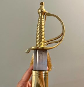
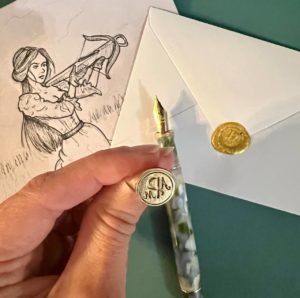
Since my fantasy adventure novels are set in a world heavily inspired by the 18th century and feature lots of sword fights and swashbuckling with similar weapons, I thought this was the perfect subtle design element to incorporate into my logo. I knew that I wanted it to double as my own personal monogram as well, so I placed the initials into a circle to round out the design (pun intended), et voilà! The logo was complete.
I sent the sketch to my graphic designer, and quickly had the finished file to use on my website. Since I like to send hand-written letters to friends and family, I’ve always wanted a custom wax seal ring, so I flipped it mirror-image and sent the file to a ring designer on Etsy. Now I have my own ring for sealing letters.
So, that’s the rundown of how I created my author logo. If you’ve created one of your own, tell me about your process in the comments!
No Comments